Tuesday, December 26, 2017

HOLIDAY DOORS 2017


This time last year, we were a bit busy. After 45 years of hanging our hats in one place, we found ourselves in the midst of moving our family business from one location to another right during the Christmas Holidays. Dwelling in a 26,000 square foot facility for so many years makes for a lot of stuff.  Sifting through several generations of records, samples, and merchandise, packing it, moving it, up fitting a new space - all while trying to conduct business as usual in the midst of the hustle and bustle of Christmas - was (needless to say) a unique experience.

Everyone would ask, "How is it going?  I just can't imagine..." The truth is that it was like giving birth, dying, getting married, and moving all at the same time.  Needless to say, I did not really savor the beauty of the holiday season.

It is now a year later.  I am so grateful for the new beginning of our new location, for our faithful friends and clients, and for the joy of working among such beautiful things and people.  One of my favorite Christmas traditions is taking in all the creative decorations in our city, particularly the holiday doors.  And while last year forced me to take a year off, I am thrilled to return to the wonderment of the decorations of this season.  With that, I offer up 2017's Holiday Doors, Is One Yours?

I just love this!

Enchanted by the curved opening, lattice door and double wreaths.
This is one of my favorites. Just simple and gorgeous.
Regal.

Fretwork. White Bow. Pretty.
Chippendale door, greenery and red bow.


 Magnolia leaves and berries.

The ivy growing up the brick front, the magnolia garland and wreath. It's perfect.
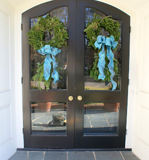
I love the rich blue color of this door!


Beautiful!
Gorgeous rich silk deep apricot bows.


Merry Christmas!

Wednesday, February 10, 2016

The Magic of Designer/Client Partnership

Ashlyn & John Whitford built their dream home a few years ago. As with any smart homeowner, she relied on interior designers to help her make her decisions throughout the building process. However, when it came to the interior of the home, one artist/designer friend seemed to really "get" her style.
As she began the process, it was clear they were a match!  Both client and designer began pulling pictures from magazines, and it turned out they were dog-earing the same pages.  It was clearly a match made in home design heaven, and Ashlyn hired Sloan Ward to help make her make the interior of her home exactly the way she wanted it. The pictures speak for themselves.  Lovely in every sense of the word.  One cannot help but be inspired.  Well done, ladies!

Who wouldn't want to work in this office?  I adore this light fixture which adds a bit of modern edge to the Palm Beach vibe.  The cane chairs were the client's, but Sloan had them upholstered in fabric with trim.


Love the West Elm Parson's desk, the Megg Braff wall covering and the regency bookshelves.

Stark antelope rug and Palm Beach ceramic pieces are timeless.
                                   
Note the details: cording on chairs, trim on panels.
                       

Back hall has same antelope runner by Stark. 
                                           
David Hicks wallpaper with custom window treatment in half bath.
 
The family room off the kitchen is stunning!  A great example of how you can be glamorous AND functional at the same time. 

  Love the triple gourd silver lamps by Julian Chichester, the regency mirror, and custom pillows on the sofa. The mirror is Celerie Kemble, and the pillows are custom Madeline Weinrib and Manuel Canovas. Parsons side tables were the clients own. The table is a vintage Mastercraft.


Custom chair in gold velvet with Brusnschwig & Fils "snow leopard" pillow. 
                             
A view from the rear.
Again, its all in the details. Sloan went through tons of purple fabrics to find the right hue. Color is crucial.
The elephant side tables were found on one of their shopping trips and add the perfect touch of Palm Beach glamour.


Friday, January 8, 2016

A Seamless & Classic Renovation

A friend and her family recently moved back into their home after a long renovation. From the beginning, this two story brick colonial had great bones. However, the rooms were a bit small, and it was hard to fit extended family and friends into any space to entertain easily. In addition, this home (and its owners) were just itching for a first floor master and a larger updated kitchen.

One of the greatest challenges in renovations is how to make the new blend in with the old.   The word every architect, designer and homeowner strives for is SEAMLESS.  A prime example of this is when original ceiling heights are lower and the newer ones seek greater heights.  In this home, the  8' original heights needed to transition to 9' new heights.  With the clever collaboration between the owners and architect, a plan was hatched to widened the hallways and doorways to give the appearance of a taller ceiling height in the original spaces as they moved into the newer ones. It worked!  The final result is, indeed, seamless.

Here is a peak inside this beautiful home.

The front door changed from a single to double doors. The hallways and doorways widened and created a much larger feel for a more inviting entrance. 
                                   
My friend also chose custom wool ribbed runners for her foyer and three adjoining hallways furthering a seamless transition.

          
Expanded living room.  Great for entertaining.

The use of a white, cream and natural palette gave an consistent openness to the home.
                   

Long, wide hallways off the main foyer create a bigger more open space.


A new custom family room, kitchen and porch.

Another great space for entertaining and enjoying family.


This porch is simply wonderful in every way.  

Kitchen and breakfast nook.


Clean lines in lovely kitchen.  The custom hood sets the tone. 
                                   
The butler's pantry sits off the kitchen where everything is easily accessed.
           
Love the half bath - the wallpaper, the vanity, everything!


A view from the back hallway.


I love that the owner paid attention to the details of the front door.  It is a wonderful place to splurge!


Tuesday, December 22, 2015

2015 Holiday Doors, Is One Yours?


This season's erratic weather does not make outdoor decorating easy.  Rainy days can wreak havoc on silk bows, and warm temps does nothing to help our greenery.  Nevertheless, Raleigh has come through with some gorgeous doors.  I couldn't be prouder of my town and the fabulous design talent we have right here in our midst.  Our doors are simply lovely.
And so, without further delay, I present this year's Holiday Doors.  Is one yours?


Sophisticated gray and gold.

Nothing like double pink loopy bows for southern Christmas charm.


Handsome design here with square wreaths and natural tones.


A welcoming entrance.
               
Another double wreath combo and this time with classic red.

Simply elegant.

I wish my lighting was better here.  The off center tartan bows are so charming!

A great example of what great lighting does for a door.


Fabulous combo of greenery.  Adore the magnolia up top.


This has a easy elegance to it that makes me want to pop in for a visit.


Merry Merry!


I could go on and on... the woven ribbon, the cross, the woodwork... 

Big bow!


The perfection of these clean lines is dreamy.

The Nutcracker soldiers are a fun touch.

Putting a wreath in an unexpected place is always clever.


Lots of depth and sophistication in this design.

The owners recently moved into this home, and I love that they wasted no time getting their holiday decor in full swing.


A classic door.

A sweet cross.